Build a graph
Iterating with ggplot2
1 Lesson overview
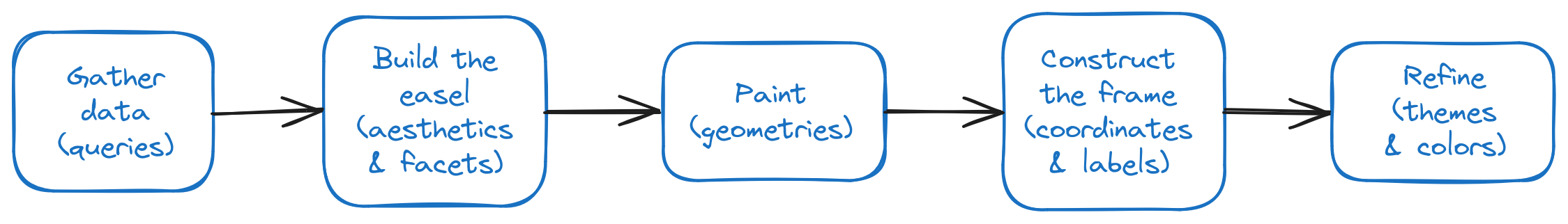
In this set of problems, we are going to go through the process for building a graph in R using the ggplot2 package (as shown in Figure 1).
Working through this document to learn ggplot2 is analogous to learning to fly while a pilot is sitting in the seat next to you with controls so that he/she can take over. First, it will be a lot! Second, you will get lots of support and hints throughout. By the end, you should have a much better sense of how the process works, how the pieces fit together, and how to use the ggplot2 package to create your own graphs.
Note that you will only rarely go through this whole process when defining a ggplot2 graph. Most of the time, you will go through the first three steps — gather the data, build the easel, and paint (apply geom_* layers). And that’s it. So don’t be put off by the size of this lesson. We have included as many of the basics as we can in this one lesson. The rest of the course will basically be about different geom_*s.
1.1 Using this document
Within this document are blocks of R code that you can modify — it has a Run Code button in the upper right. (Other R code that is just for display, is shown in an unadorned gray box.) You can edit and execute this code as a way of practicing your R skills:
- Edit the code that is shown in the box as desired. Click on the
Run Codebutton. - Make further edits and re-run that code. You can do this as often as you’d like.
- Click the
Start Overbutton to bring back the original code if you’d like. - If the code has a “Test your knowledge” header, then you are given instructions and can get feedback on your attempts.
1.2 Using RStudio
The easiest way to work through the exercises in this document are within this document. However, you can also complete these exercises within RStudio. In order to set up the environment so that you can successfully complete them, you should copy the code in the following section and execute them at the prompt.
1.2.1 Open the project
Before doing anything else within RStudio, open the project for this lesson so that you have access to the data and source code that enables all the rest.
1.2.2 Set up
If you’re following along with this exercise in RStudio, then you need to execute the following code in the Console. If you are going through this set of exercises within this document, you don’t have to do so because we are loading this libraries for you.
library(tidyverse)
library(tidylog)
library(skimr)
library(hexbin)
library(RColorBrewer)
library(ggthemes)- The first line loads the
tidyversepackage. You could actually load just the packagesdplyr,purrr,stringr, andggplot2to save on memory, but with today’s computers and the types of things that you’re doing at this point, you don’t need to worry about load speed and/or memory usage just yet. - The second package tells
Rto give more detailed messages. - The
skimrpackage enables theskimfunction that provides a convenient way to explore data frames. - The
hexbinpackage enablesggplot2to createhexgraphs.
1.3 Reading in the data
A data frame is like a table in a database or a spreadsheet. It has rows and named columns. Most of the time—as we do here—we load data from a file or database. The following reads in the survey and university data that we will be using.
If you are working within RStudio, then execute the following code in its Console:
source("source/read_in_survey.R")
source("source/read_univ_data_simple.R")
2 Gather data
We are going to use two sources of data in this lesson. (These are also the two sources that we will use throughout this course, so time spent getting familiar with them will pay off.)
The first data set is from a simulated survey of alumni who have been asked 10 questions about reasons that they would not recommend the school. Thus, the Bad Advising question is “Bad advising is/was a problem for me at the school.” Thus, Strongly Disagree would be a good outcome.
The second data set is simulated university data from the past 10+ years about students and the grades they received in the classes that they took.
2.1 Gather data: survey
In this set of problems (as in the rest of this course), we are not going to be concerned with gathering the data for the graph. We are going to assume that the data is already in a data frame and that it is in the correct format.
The following is the data frame that we are going to use for this problem set. Each row of the data frame represents a unique combination of Question and Response. It has the following columns:
Question- The question identifier
Response- The chosen response for the question
NumResp-
The numeric value of the response,
1isStrongly Disagreethrough5isStrongly Agree Count- The number of times this response was chosen by a survey respondent
Average-
The average value response for this question;
3is the median choice; closer to1is a good outcome while closer to5is a bad outcome
So, let’s read the data in the first two lines:
- Related to the
Bad Advisingquestion, theStrongly Disagreeresponse is identified byNumResp = 1. This response was chosen8992times. The overall average response to this question is2.3299. Since the choices range from1to5, this average indicates that the average response is betweenDisagreeandNeutral. - Related to the
Bad Advisingquestion, theDisagreeresponse is identified byNumResp = 2. This response was chosen7086times. The overall average response to this question is2.3299. Since the choices range from1to5, this average indicates that the average response is betweenDisagreeandNeutral.
The rest of the 50 rows are interpreted in the same manner.
2.2 Gather data: grades
This is quite a large set of grades — it contains over 400,000 rows of 27 columns. The following commands list the names of the columns and then shows a sampling of the data.
3 Build the easel
In this step, you define how the included columns will be represented in the graph (through aesthetics and facets). You might think of these steps (of gathering data and building the easel) as defining the universal architecture of the graph. It tells R how which data is going to be represented in what way (axis, color, shape, etc.). The information you enter here will apply throughout the graph.
This is the very heart of the graph description process, and the one that most differs from spreadsheet tools.
3.1 Aesthetics
We are breaking this step into two parts. The first part is to define the aesthetics of the graph.
Defining the aesthetics of a graph means that you are focusing on the following:
- What data will be on the
x-axis? - What data will be on the
y-axis? - What data will be used to
fillthe bars/points/shapes? - What data will be used to
colorthe outline of the bars/points/shapes?
The important point to ask yourself is, “Do I want the x values, y values, fill color, outline color, or shape to be different for each of the rows in the data frame?” If so, then you need to define that in the aesthetics.
The form of the aes() function is:
ggplot(aes(x = ColNameA,
           y = ColNameB,
           fill = ColNameC,
           color = ColNameD,
           linewidth = ColNameE,
           linetype = ColNameF))
The above can be interpreted as follows:
In the graph to be drawn — we don’t know what forms it will take yet — values along the
xaxis will represent values fromColNameA; values along theyaxis will represent values fromColNameB; different values ofColNameCwill result in the plotted item being filled with a different color; different values ofColNameDwill result in the plotted item being outlined with a different color; different values ofColNameEwill result in different widths of lines; and different values ofColNameFwill result in different types (dotted, dashed, etc.) of lines.
To be very clear, it is a very rare graph that will use more than even three of these.
A couple of things to note:
- For almost every graph type, the
xandyvalues are required. Thefill,color,linewidth, andlinetypeare optional. That is, the complete statement could be as follows:
ggplot(aes(x = ColNameA, y = ColNameB))In fact, we generally start the whole graph definition process with just these two values. We then add the other values as we refine the graph.
Also, one more shortcut can be used. For the x and y arguments, you can actually just use the column names (in x, y order) as follows:
ggplot(ColNameA, ColNameB)- Any of the column names above can be used multiple times! That is, for example, you can have both the
xand thefillboth vary by the same column if you’d like.
Also, consider the following form of the ggplot() and aes() functions:
ggplot(aes(x = ColNameA,
           y = ColNameB),
       fill = SomeValue,
       color = SomeValue,
       linewidth = SomeValue,
       linetype = SomeValue)
The difference between Listing 1 and Listing 2 is that the first one is using column names from the data frame, while the second one is setting the fill, color, linewidth, and linetype to a single, constant value across all values of all columns. This is useful when you want to set the color of the bars to a single color, for example.
Possible values for fill, color, linewidth, and linetype (and many other attributes) are specified in detail in the ggplot/aes documentation.
A general confusion around aes()
The aes() function is a mapping function. It tells ggplot2 how to map the data in the data frame to the graph. It does not actually create the graph. You need to add a geom_ function to do that (and we’ll do that in Section 4).
Something else has to be discussed at this point — the important difference between x and y values and its importance to ggplot as it relates to categorical variables (or dimensions) and numerical variables (or measures). This is a distinction that you will come back to frequently, so it is worth spending a bit of time on.
- Categorical
- These are the ways in which we can categorize or slice the data. These are usually strings but sometimes can be a small set of integers. Examples for higher ed data are gender, race, grades, survey responses, and home state.
- Numerical
- These are the facts that we report on. These are usually decimal (real, floating point) numbers or dates, but they can also be integers if they can take a large number of values. Examples for higher ed data are SAT scores, GPA, age, counts of students, and counts of responses.
The important point to remember is that ggplot will treat the x and y values differently depending on whether they are categorical or numerical. If you put a categorical variable on the x axis, it will be treated as a set of discrete values (and you will get, for example, vertical bars if you’re using a bar chart). If you put a categorical variable on the y axis, then you will get, for example, horizontal bars if you’re using a bar chart.
You now have the information — and it’s a lot of information — you need to take your first step in creating a graph in ggplot. (Trust us when we say that this will, eventually, not seem so complicated. You just need to practice.) Let’s do that.
1: Test your knowledge
For a particular question we want to show, for each response, the number of responses. For now, let’s ignore the “particular question” part of this description; we’ll handle it in the next exercise.
Refer back to Section 2.1 to familiarize yourself with the columns available to you.
To give us something concrete to think of for now, let’s envision a bar chart. (We can change this later, but we find that it helps at this early stage of learning ggplot to have something concrete to think about even if we’re not at the stage of defining the code for it yet.) More specifically, let’s think about a horizontal bar chart. We want the fill color of the bar chart and the height (length?) of each bar to vary depending on the particular response chosen.
In order to complete the ggplot(aes()) command, you need to complete the following statements:
- Since this will be a set of horizontal bars, the categorical column blank will be on the blank axis.
- The height (length) of the bar is determined by the value in the blank column. This will be the blank axis.
- The fill color of the bar is determined by the value in the blank column.
- Which bars will be created is determined by the values in the blank column.
Complete the following code (using the above completed statements) to create the ggplot(aes()) command.
H1: A bit of help
First of all, you know that the aes() function goes inside the ggplot() function. To start off, what will be the values of the x and y arguments? Be sure to take into account that this is going to be horizontal.
Also, let’s complete those statements:
- Since this will be a set of horizontal bars, the categorical column Response will be on the y axis.
- The height (length) of the bar is determined by the value in the Count column. This will be the x axis.
- The fill color of the bar is determined by the value in the Response column.
- Which bars will be created is determined by the values in the Response column.
See if you can write the most basic aes() inside the ggplot() in the above code block before you continue.
H2: A bit of help
We use x = Count and y = Response to create a horizontal bar chart. The Count column is the one that will be used to determine the height (length in this case) of the bar. The Response column is the one that will be used to determine what the bars are going to represent — each bar will represent the number of times a particular response is chosen.
How do you specify the fill value? Is this argument within or outside the aes() function? Do any other arguments need to be specified before we have done all that has been asked for this question?
Solution
We also want the color fill to be based on the Response value. Note that we have both the height (length) of the bar and the fill color based on the same column. This helps the reader to compare values for the same response across different questions. It also helps the reader more quickly interpret the shape of the graph.
Note that it would be perfectly reasonable to, the first time you are defining this graph, to just use the x and y values. You can add the fill value later.
pipe versus the plus
When building R/tidyverse queries, we assembled them using the pipe (|>) operator. It directed the output of one function to the input of the next function. This is a very powerful and flexible way to build queries.
Building a ggplot2 graph is a bit different. The ggplot2 package is designed to be used in a layered fashion. You start with the ggplot() function, which defines the data frame and the aesthetics. Then you add layers to the graph using the + operator. Each layer can be a different type of graph, a different set of aesthetics, a different set of titles, etc.
Thus, a ggplot2 graph description is a bunch of functions linked together by plus (+) operators. The rest of this lesson will guide you through the process of building a ggplot2 graph, assembling it with a variety of functions linked by the + operator.
3.2 Facets
R’s faceting capabilities are both hard to wrap one’s head around (since they differ so much from the possibilities available in other applications) while simultaneously being very easy to try out.
Simply put, to add a facet to a graph means that you want ggplot to create a separate graph for every single value of a discrete variable. You would use facet_wrap to define graphs based on one variable and facet_grid to define graphs based on all the value combinations of two variables.
In the following, we assume that Department, Gender, State, and Race are all the names of legitimate columns containing categorical variables. If they were numerical variables, then the faceting would be done by ranges of values. For example, if Department were a numerical variable, then the faceting would be done by ranges of values for Department. However, these facets are almost always defined on categorical columns.
3.2.1 facet_wrap()
facet_wrap(~ColName)- Explanation: This is the most common form of faceting. It creates a separate graph for each value of a single variable. The graphs are arranged in a grid, but the number of rows and columns is determined by the number of values in the variable.
- Example 1: Suppose you are examining the student grade distributions by department (for 12 different departments). Then you could define the faceting as
facet_wrap(~Department). This would create a separate graph for each department, with the graphs arranged in a grid (probably3x4or4x3). - Example 2: Suppose you are examining financial aid packages and trying to detect differences by gender (for which you have three in your system). You could define the facet as
facet_wrap(~Gender). This would create a separate graph for each gender (probably2on one line and1on the next).
The form of the facet_wrap function is:
facet_wrap(~ColName[,
           nrow = SomeValue][,
           ncol = SomeValue][,
           scales = "fixed"/"free"/"free_x"/"free_y"])
It is quite common for calls to this function to be the quite simple facet_wrap(~ColName) with no options needed. However, we want to make you aware of the options. The options shown above are:
nrowandncol(use only one): These options allow you to specify the number of rows and columns in the grid. If you don’t specify one of these options,ggplotwill automatically determine the number of rows and columns based on the number of values in the variable.scales: This option allows you to specify whether the scales for the x and y axes should be fixed or free. If you setscales = "free", then each graph will have its own scales. If you setscales = "fixed", then all graphs will share the same scales. The default (’“fixed”`) is generally fine to start with, but you might want to change it later if you want to see the differences in the data within an individual graph more clearly.
3.2.2 facet_grid()
Now, let’s take a moment to examine facet_grid().
facet_grid(ColNameForRows ~ ColNameForColumns)- Explanation: This is a more complex form of faceting. It creates a separate graph for each combination of values in two variables. The graphs are arranged in a grid, with the rows and columns determined by the values in the two variables.
- Example 1: Suppose you are examining student grade distributions by department and gender. Then you could define the faceting as
facet_grid(Department ~ Gender). This would create a separate graph for each combination of department and gender, with a department per row and a gender per column. - Example 2: Suppose you are examining the distribution of academic performance scores and trying to determine differences by race and by state. You could define the facet as
facet_grid(State ~ Race). This would create a separate graph for each combination of state and race, with one state per row and one race per column.
The form of the facet_grid function is:
facet_grid(ColNameA ~ ColNameB[,
           scales = "fixed"/"free"/"free_x"/"free_y"][,
           axes = "margins"/"all_x"/"all_y"/"all"][,
           axis.labels = "all"/"margins"/"all_x"/"all_y"])
As with the facet_wrap function, it is quite common for calls to this one to be just facet_grid(ColNameA ~ ColNameB) with no options needed. The options shown in the above are:
scales: same as the aboveaxes: This option allows you to specify which axes should be shown. The options are:"margins": show the margins for both axes along the margins of the figure; this is the default"all_x": show all x-axis labels"all_y": show all y-axis labels"all": show all labels for both axes on every graph
axis.labels: This option allows you to specify which axis labels should be shown. The options are:"all": show all labels for both axes on every graph"margins": show the margins for both axes along the margins of the figure; this is the default"all_x": show all x-axis labels"all_y": show all y-axis labels
Note that the first line of Listing 4 shows the historical form for specifying the rows and columns. The following is now the preferred method of naming them:
facet_grid(rows = ColNameA,
           cols = ColNameB)
While we would not recommend it, you might also see this function specified using shorthand to refer to the rows and columns, as follows:
facet_grid(ColNameA,
           ColNameB)
Personally, we prefer the form shown in Listing 5 since it is clear which column of the data frame is being used for the rows and which column is being used for the columns. For both of the other forms, the reader (which might be you even if you wrote the command) might have to stop and think about which column is which.
If you want to see the full list of options for facet_wrap and facet_grid, you can check out their documentation pages (facet_wrap, facet_grid).
As we stated before, these two commands have many options that you can explore in the documentation (and in this example!).
2: Test your knowledge
Continuing with the example from the previous section (as we will for the rest of this lesson), we want to create a separate graph for each question.
Add the appropriate command at the end of the ggplot(aes()) command.
H1: A bit of help
The first set of questions you should be asking yourself about faceting is the following:
- Do I want to create a separate graph for each value of a single column or each combination of values for two columns?
- What column or columns?
If you have the answer to the above questions, then you should be able to complete the question.
H2: A bit of help
Our answers to the above questions are:
- We want to create a separate graph for each value of a single column.
- The column is
Question.
This gives you enough information to complete this exercise.
Solution
Run the following code to see the result of your work so far.
Note that there are 10 different graphs, one for each question. The graphs are arranged in a grid, with the number of rows and columns determined by the number of values in the Question column. If the graphs seemed too squeezed, then you might consider decreasing the number of columns by setting the ncol argument to a smaller value. Try it out!
Also, note that the values on the y axis are set to each of the responses, and the x axis has a maximum of just less than 15,000. R/ggplot2 has determined that no question has a bar longer than about 15,000.
4 Paint
Applying the analogy of graph making to the painting process, in this step you will be painting the data onto the easel that you constructed in the previous step. This is the last vital, and challenging, step of the R/tidyverse graph creation process. Everything after this step is essentially just “framing” the graph. This step, in particular, is where you will be doing most of your creative work.
The primary tool of the painting process is the set of geom_*() functions. These functions are the ones that actually create the graph. They are the ones that define the type of graph (bar, line, point, etc.). The R/tidyverse package has a large number of these functions. The most common ones are the following.
You can learn more about settings for the various options listed at the ggplot2 documentation.
4.1 Bar
The most common type of graph that you will be creating is a bar chart. These come in a couple of different flavors:
- Stand-alone bar charts
- Each bar represents some value related to a single variable. It might be a histogram showing relative proportions across a continuous variable, or it might be bars showing the number of majors per department.
- Bar groupings
- Each bar represents some value related to one variable but grouped by another variable. It might be a count of the number of courses taken by students of a specific type and grouped by the term in which they took the course. Or it might be the number of graduating students with a specific major and grouped by the year of graduation.
We go through the stand-alone bar charts first in Section 4.1.1, and then we go through the bar groupings in Section 4.1.2.
4.1.1 Stand-alone bar charts
In this section we consider three different types of stand-alone bar charts:
- Histogram (Section 4.1.1.1)
- This is a bar chart that shows the distribution of a continuous variable. It is created by dividing the range of values into bins and counting the number of values in each bin.
- Bar chart (implicit height) (Section 4.1.1.2)
- This is a bar chart that shows the number of rows in the data frame for each value of a categorical variable. The height of the bar is determined by the number of rows in the data frame that have that value.
- Bar chart (explicit height) (Section 4.1.1.3)
- This is a bar chart that shows the value of a continuous variable for each value of a categorical variable. The height of the bar is determined by the value in the continuous variable.
4.1.1.1 Histogram
- Form:
ggplot(aes(Cont)) + geom_histogram(binwidth/bins = SomeValue) - Description: This function creates a histogram; that is, as applied to a continuous column, it creates a bar chart where the height (length) of the bar is determined by the number of rows that fall within the range of values defined by the
binwidthorbinsargument. It is used to visualize the distribution of the values in the continuous column.- If you specify
binwidth, then the width of each bin is determined by the value ofbinwidth(in terms of the scale of thex-axis). The number of bins is determined by the range of values in the column divided by the value ofbinwidth. - If you specify
bins, then the number of bins is determined by the value ofbins. The width of each bin is then automatically determined by the range of values in the column divided by the value ofbins. - You can specify one or the other. You will probably have to experiment with the proper values to get the desired result.
- If you specify
- Common options:
bins/binwidth/breaks,na.rm,center,boundary,pad,alpha,color,fill,linewidth - Documentation:
geom_histogram
4.1.1.2 Bar chart (implicit height)
- Form:
ggplot(aes(Disc)) + geom_bar() - Description: This function creates a bar chart. It creates a bar for each row in the data frame. The
xcolumn determines the number and names of the columns; the height of the column is determined by a count of the rows that have that particular value. If you want to specify the height of the column — actually, if you want the height of the column to be anything other than the count of the rows — then you should not use this function. - Common options:
alpha,color,fill - Documentation:
geom_bar
4.1.1.3 Bar chart (explicit height)
- Form:
ggplot(aes(DiscX, ContY)) + geom_col() - Description: This is the most common function for creating a bar chart. It creates a bar chart where the height (length) of the bar is determined by the value in the
ycolumn. Thexcolumn is used to determine which bars are created. Note that if you reverse thexandycolumns, then you will get a horizontal bar chart. This is the function that we will be using for this problem set. - Common options:
alpha,color,fill - Documentation:
geom_col
4.1.2 Bar groupings
In this section, we consider three types of ways that we can show groups of bars:
- Bar chart (stacked value) (Section 4.1.2.1)
-
This is a bar chart where the height of the bar is determined by the value in the
ycolumn. Thexcolumn is used to determine which bars are created. Thefillcolumn is used to determine how the bars are stacked. - Bar chart (stacked percentage) (Section 4.1.2.2)
-
This is a bar chart where the height of the bar is determined by the value in the
ycolumn; the height of each section of the stack is determined by its percentage of the total value for that group. Thexcolumn is used to determine which groups of bars are created. Thefillcolumn is used to determine how the bar is sectioned. - Bar chart (grouped) (Section 4.1.2.3)
-
This is a bar chart where the height of each separate bar is determined by the value in the
ycolumn. Thexcolumn is used to determine which groups of bars are created. Thefillcolumn is used to determine which bars make up the group.
Another option is to use facets for the grouping column and create graphs as you did in Section 4.1.1. The groups are then shown as separate graphs. This is a good option if you have a lot of groups and you want to see the differences between them.
All of the graphs in this section use the grade_studenttype_summary data frame. This is calculated from the grade_info data frame as follows:
- The columns
Term: the term in which the course was takenStudentType: the type of student (e.g., first-time, transfer, etc.)NumCourses: the number of courses taken by that type of student in that term
- The data frame is filtered to include only students who have graduated and who were admitted in the last 8 years. This is done to focus on the most recent data.
4.1.2.1 Bar chart (stacked value)
- Form:
ggplot(aes(DiscX, ContY, fill=DiscF)) + geom_col() - Description: This function creates a bar chart where the height of the bar is determined by the value in the
ycolumn. Thexcolumn is used to determine which bars are created. Thefillcolumn is used to determine how the bars are sectioned off. This is the most common form of a bar chart. - Common options:
alpha,color,fill,linewidth - Documentation:
geom_col
4.1.2.2 Bar chart (stacked percentage)
- Form:
ggplot(aes(DiscX, ContY, fill=DiscF)) + geom_col(position="fill") - Description: This function creates a bar chart where the height of each section of the stack is determined by its percentage of the total value for that group. The
xcolumn is used to determine which groups of bars are created. Thefillcolumn is used to determine how the bar is sectioned. Theycolumn is used to determine the height of each section. - Common options:
position,alpha,color,fill,linewidth - Documentation:
geom_col
4.1.2.3 Bar chart (grouped)
- Form:
ggplot(aes(DiscX, ContY, fill=DiscF)) + geom_col(position="dodge") - Description: This function creates a bar chart where the height of each section of the stack is determined by its percentage of the total value for that group. The
xcolumn is used to determine which groups of bars are created. Thefillcolumn is used to determine how the bar is sectioned. - Common options:
position,width,alpha,color,fill,linewidth - Documentation:
geom_col
4.2 Points & lines
4.2.1 Scatter plot
- Form:
ggplot(aes(ContX, ContY)) + geom_point() - Description: This function creates a scatter plot. It creates a point for each row in the data frame. The
xandycolumns are used to determine the position of the point. - Common options:
alpha,color,fill,size,shape - Documentation:
geom_point
4.2.2 Line chart
- Form:
ggplot(aes(ContX, ContY)) + geom_line() + geom_point() - Description: This function creates a line chart. It creates a line for each row in the data frame. The
xandycolumns are used to determine the position of the point. - Common options:
alpha,color,size,linetype - Documentation:
geom_line
We include geom_point() in the above form to show the points on the line. This is not necessary, but it is often helpful to see them. If you don’t want to highlight the points, then don’t include geom_point().
4.2.3 Arbitrary line
- Form:
ggplot(aes(...)) + geom_abline(aes(intercept = B, slope = M)) - Description: This function draws a line. The
interceptandslopevalues are used to determine the position of the line. - Common options:
alpha,color,size,linetype - Documentation:
geom_abline
Note that when you include two geom_*()s in a graph, the later one is on top of the earlier one.
4.2.4 Horizontal line
- Form:
ggplot(aes(...)) + geom_hline(aes(yintercept = B)) - Description: This function draws a horizontal line. The
yinterceptvalue determines the position of the line. - Common options:
alpha,color,size,linetype - Documentation:
geom_hline
4.2.5 Vertical line
- Form:
ggplot(aes(...)) + geom_vline(aes(xintercept = Xval)) - Description: This function creates a vertical line. The
xinterceptvalue is used to determine the position of the line. - Common options:
alpha,color,size,linetype - Documentation:
geom_vline
4.3 Text
4.3.1 Plain text
- Form:
ggplot(aes(ContX, ContY)) + geom_text(aes(label = ColName)) - Description: This function places
labelat specific coordinates. It creates a label for each row in the data frame. - Common options:
vjust,alpha,color,size,fontface - Documentation:
geom_text
4.3.2 Text with background
- Form:
ggplot(aes(ContX, ContY)) + geom_label(aes(label = ColName)) - Description: This function creates a text label with a background at specific coordinates. It creates a label for each row in the data frame.
- Common options:
alpha,color,size,fontface,vjust,fill - Documentation:
geom_label
4.4 Distributions
4.4.1 Box & whiskers
- Form:
ggplot(aes(DiscX, ContY) + geom_boxplot() - Description: This function creates a box & whiskers plot. It is used to visualize the distribution of a continuous variable.
- Common options:
alpha,color,size,linetype - Documentation:
geom_boxplot
After running the following code, add fill = ProbableMajorType to the aes() and see what happens.
4.4.2 Violin plot
- Form:
ggplot(aes(DiscX, ContY)) + geom_violin() - Description: This function creates a violin plot. It creates a violin for each row in the data frame. The
xandycolumns are used to determine the position of the point. Thefill,color,linewidth, andlinetypecolumns are used to determine the appearance of the violin. - Common options:
alpha,color,size,linetype - Documentation:
geom_violin
4.4.3 Density plot
- Form:
ggplot(aes(ContX, ContY)) + geom_hex() - Description: This function creates a hexbin plot. It creates a hexagon for each row in the data frame. The
xandycolumns are used to determine the position of the point. Thefill,color,linewidth, andlinetypecolumns are used to determine the appearance of the hexagon. - Common options:
bins/binwidth,alpha,color,size,linetype - Documentation:
geom_hex
3: Test your knowledge
Now that we have drawn the easel, we need to paint the data onto it. In this case, we want both to use horizontal bars to represent the number of responses for each question and to draw a red horizontal line to represent the average response to each question. In addition, we want the bars to have a black outline to a width of 0.1. While you’re at it, experiment with values of 1 and 3 as well as leaving the argument out altogether.
Your first steps should be to determine which geom_*() functions to use. You need one for the horizontal bars and one for the line. Go back through all the examples in Section 4, find the ones that seem right, and add them to the code block below. After you have the basics working, then you can go about refining the rest of the details.
H1: A bit of help
We chose to use geom_col() and geom_hline() for this graph.
If you’re having trouble specifying the geom_hline() layer, then note the following:
- The
yinterceptis specified within theaes()within thegeom_hline()function. - An
aes()specification withinggplot()is inherited by allgeom_°()s that follow. - If a
geom_*()needs an option that is not specified by theggplot(aes()), then the option should be specified within thegeom_*()itself.
Now, try to complete the specification of both geom_*()s.
H2: A bit of help
If you have gotten both geom_*()s to display on the ten graphs, then you should just finish refining them:
- set the outline color for the bars
- set the width of the outlines for the bars
- set the color of the horizontal line
Solution
Here is the full solution:
Think of all that has been accomplished here:
- Defined a horizontal bar chart
- Defined separate charts for each question
- Colors for the same answer are the same across all the charts
- Drew a line for the average answer
That’s not to say that it’s perfect…but it’s good enough to figure out that the school has some obvious problems with overall value, schedule, and financial aid.
5 Construct the frame
Applying the analogy to the painting process, in this step you will be constructing the frame around the graph that you constructed in the previous steps. To be more specific, this step goes through the process of defining the titles, legends, and axis scales.
5.1 Coordinates
The first step of this process is to refine the axis scales. This is handled by the following functions:
scale_x_continuous()scale_y_continuous()scale_x_discrete()scale_y_discrete()
As you might guess, you describe both a continuous x and y axis in the same way. The same goes for discrete axes. Given both of these, we discuss just the functions for just the x axis in the following; these descriptions would be the same for the y axis.
Generally, you will not use these functions until after you see what ggplot does on its own. Many times the defaults will be just fine. However, if not, then the following are the more common arguments that you will set.
- Continuous scales
- These are on an axis that is typically used for numerical values, such as measurements, percentages, or counts, which can take on any value within a range.
limits = c(min, max): Sets the minimum and maximum values for the axis. You might use this to show the full range of GPAs from0.0to4.0instead of a truncated version that the data covers.breaks = c(b1, b2, ..., bN): Specifies the positions of the tick marks on the axis.labels = c("l1", "l2", ..., "lN"): Defines the labels for the tick marks. The values in this list correspond with the values in thebreakslist. You should only define this value if you have also defined abreaksvalue.
The following shows the usual full specification of a continuous scale.
x scale) using the three main options
scale_x_continuous(limits = c(MIN, MAX),
                   breaks = c(MIN, B2, ..., MAX),
                   labels = c("min", "b_2", ..., "max"))
This code shows that breaks includes both the MIN value and the MAX value since that is standard good practice. (You do not have to do this, but it would have to be for a good reason.) Note that the labels can be whatever string you like; you might represent money as "$0k", "$1k", "$2k" or whatever makes sense for your data.
- Discrete scales
- These are on an axis that is typically used for categorical variables, such as names, labels, or groups, which represent distinct and separate values.
limits = rev: Reverses the order of the axis values. You might use this when the values on the axis are in the opposite order in which you want to view them.breaks = c(b1, b2, ..., bN): List all the discrete values that you want to show on the axis.labels = c("l1", "l2", ..., "lN"): Defines custom labels for the tick marks in the same order as in thebreakslist.guide: Adjusts the appearance of axis labels.guide = guide_axis(angle = 45): Rotates the axis labels by 45 degrees.guide = guide_axis(n.dodge = 2): Staggers the axis labels to avoid overlap. This can be quite useful for longer labels.
x scale) using the three main options
scale_x_discrete(breaks = c(B1, B2, ..., BN),
                 labels = c("l_1", "l_2", ..., "l_n"),
                 guide = guide_axis(...))
In the following example, we demonstrate how to define both a discrete axis and a continuous axis.
- We use
scale_x_discrete()becauseProbableMajorTypeon thex-axiscontains four distinct values. We use this function to specify the order in which we would like them to appear, set the appearance of the labels, and set them at a slight angle (just for the heck of it). - We use
scale_y_continuous()becauseUnivGPAon they-axisallows continuous values. We want the axis to go from[0, 4]and we want breaks on the axis every0.5.
As usual, you can set or change any value in this graph description.
4: Test your knowledge
We are now going to construct the frame of this graph; that is, we are going to refine the axis scales.
x-axis-
Look at the current
x-axisscale. It is currently set to the default values. We want to set the following:
- The
x-axisscale to be between0and15000(so that the user is able to easily see the minimum and maximum values on the axis). - The tick marks to be at
0,2500,5000,7500,10000,12500, and15000(so that the user is able to easily estimate the number of responses — that is, the length of the bar). - Rotate the tick mark labels by
45degrees (so that the tick mark labels are not crowding each other).
y-axis-
Look at the current
y-axisscale. This seems perfectly reasonable as it is currently constructed.
Improve the frame by using the scale_x_continuous() layer to refine the x-axis.
Determine which options you need to use in this layer, and then set the values.
H1: A bit of help
It appears that we need to set values for limits, breaks, and guides. Play around with each of these options and see what you think the reader would find easiest to interpret.
H2: A bit of help
We are setting the maximum value in the limits option to 15000. Note that this is the type of thing that, in the long run, you will want to write a function to calculate for you. Otherwise, given new data, the x-axis could be much too long or too short.
Solution
Take a look at our solution:
You should play with this solution to understand how some options work:
- Set the maximum to 7500.
- Make the
breaksunevenly spaced. - Dodge the
x-axisvalues instead of putting them on an angle.
5.2 Labels (labs())
Now that we’ve cleaned up the axes to our satisfaction, it’s time to move on to define labels. The labs() function defines labels throughout the graph:
title = "XYZ": Sets the main title of the graph.subtitle = "XYZ": Sets the subtitle of the graph.x = "XYZ": Sets the label for the x-axis.y = "XYZ": Sets the label for the y-axis.caption = "XYZ": Adds a caption at the bottom of the graph, often used for source information or notes.tag = "XYZ": Adds a tag, often used for labeling subplots or figures.color = "XYZ": Sets the title for thecolorlegend.fill = "XYZ": Sets the title for thefilllegend.size = "XYZ": Sets the title for thesizelegend.
Here is an example to show you how this works with our survey data.
It is good practice for you to define at least the title for any graph that you’re going to see after your current working session. You should also provide a clear title for the x and y axes if the names are somehow unclear. The rest of the options you can hold off on until you decide to share the graph with others.
As an organization, it would also make sense to come up with standard usage for the caption and tag options (if any).
5: Test your knowledge
To complete the process of refining the frame, we need to define the titles and labels. In this case, we want to do the following:
- Set the title to “Survey Responses”.
- Set the subtitle to “Analysis of fictional data”.
- Set the
x-axislabel to “Number of Responses”. - Set the
y-axislabel to be blank (i.e., no label at all).
For now, we are going to leave the legend to the right of the graphs as it is currently constructed. Later in this process, we are going to remove the legend altogether — the information is clear enough already since each bar is labelled within the graph and by removing the legend we can make the graph larger.
Solution
Run this code to see how the solution looks.
This graph is functional. It communicates information in an organized fashion.
It can definitely look better. That’s what the next step is all about.
6 Refine
The analogy to the painting process breaks down for this step. You are retroactively choosing the look of the easel and frame in this step (with the theme) and setting the colors of the graphed data (with the colors). Generally, you will define the theme for every graph but the colors for only a subset of them.
6.1 Themes
The first step in refining your graph is to set the theme.
Beware! You can spend a nearly infinite amount of time on this stage, getting sucked into the minutiae!
6.1.1 Setting the theme
What you will want to do is go through a quick exploration of these alternatives. After doing so, pick one and stick with it for a while. Apply it mindlessly to all of your graphs. Having a consistent look will make it easier for you to interpret your graphs as you develop them.
Periodically, you will want to go back to this list, or others you find across the Web, and ensure that you don’t want to change your base theme. The last thing you should ever do is use different themes within a single report or presentation.
To apply a theme to a particular graph in ggplot2, it is as simple as this:
ggplot2 graph
ggplot(aes(...)) +
  ...additional layers +
  THEME_NAME()
The graph shown in Listing 10 provides a nice playground for you to experiment with themes.
With all that being said, here are some themes for your consideration and perusal:
- Built-in
-
The
ggplot2package comes with eight built-in themes.
theme_gray(): Default theme.theme_bw(): A theme with a white background and black grid lines.theme_linedraw(): A theme with a minimalistic design and thin lines.theme_light(): A theme with a light background and grid lines.theme_dark(): A theme with a dark background and grid lines.theme_minimal(): A minimalistic theme with no grid lines.theme_classic(): A classic theme with no grid lines and a white background.theme_void(): A completely empty theme.
ggthemes- This popular package defines themes that have distinctive looks. Consider the following, just a selection of the choices that it provides:
theme_wsj(): the Wall Street Journal themetheme_economist(): the Economist magazine themetheme_fivethirtyeight(): the FiveThirtyEight themetheme_tufte(): a minimalistic theme inspired by Edward Tufte’s design principlestheme_stata(): a theme mimicking the appearance of Stata graphstheme_excel(): a theme inspired by Microsoft Excel charts
hrbrthemes-
This powerful package provides additional themes and theme components for
ggplot2. The developer focuses on the proper use of fonts in the themes.
Note that these themes do not work on this page as it requires access to font libraries. You should be able to use these themes on your local machine if you have the fonts installed.
Given the fonts you have on your system, you may be limited in which ones you can use:
theme_ipsum(): Arial Narrowtheme_ipsum_ps(): IBM Plex Sanstheme_ipsum_rc(): Roboto Condensed
He has many other tools related to scales, color palettes, and more.
Change the look of the following graph (Listing 10) by adding a series of theme_*() layers so that you can choose one that you use in your own graphs.
ggthemes package.
6.1.2 Refining the theme
As if that were not enough, ggplot2 provides many tools for customizing the look of a specific graph.
You should only need these in very special circumstances with graphs that will be seen by many people or that will appear in a publication.
Here are some theme() values that are commonly used to customize the appearance of a graph:
axis.text.xandaxis.text.y: Customizes the appearance of axis tick labels.- Example:
axis.text.x = element_text(angle = 45, hjust = 1)(rotates x-axis labels).
- Example:
axis.ticks: Controls the appearance of axis ticks.- Example:
axis.ticks = element_line(color = "black").
- Example:
axis.title.xandaxis.title.y: Customizes the appearance of axis titles.- Example:
axis.title.x = element_text(size = 14, face = "bold")(sets the size and style of the x-axis title). - Example:
axis.title.y = element_text(size = 14, face = "italic")(sets the size and style of the y-axis title).
- Example:
legend.position: Controls the position of the legend. Common values include:"none": Removes the legend."left","right","top","bottom": Places the legend in the specified position.c(x, y): Places the legend at a specific position using normalized coordinates (e.g.,c(0.8, 0.2)).
legend.title: Customizes the appearance of the legend title.- Example:
legend.title = element_text(size = 12, face = "bold").
- Example:
legend.text: Customizes the appearance of the legend text.- Example:
legend.text = element_text(size = 10).
- Example:
panel.grid.majorandpanel.grid.minor: Controls the appearance of major and minor grid lines.- Example:
panel.grid.major = element_line(color = "gray", linetype = "dashed"). - Example:
panel.grid.minor = element_blank()(removes minor grid lines).
- Example:
panel.background: Sets the background of the plotting area.- Example:
panel.background = element_rect(fill = "white", color = "black").
- Example:
plot.background: Sets the background of the entire plot.- Example:
plot.background = element_rect(fill = "lightgray").
- Example:
plot.title: Customizes the appearance of the plot title.- Example:
plot.title = element_text(size = 20, face = "bold", hjust = 0.5)(sets the size, style, and horizontal alignment of the title).
- Example:
plot.subtitle: Customizes the appearance of the plot subtitle.- Example:
plot.subtitle = element_text(size = 16, face = "italic", hjust = 0.5)(sets the size, style, and horizontal alignment of the subtitle).
- Example:
strip.text: Customizes the text in facet labels.- Example:
strip.text = element_text(size = 12, face = "bold").
- Example:
strip.background: Sets the background of facet labels.- Example:
strip.background = element_rect(fill = "lightblue").
- Example:
These options allow for fine-grained control over the appearance of your graph, enabling you to create professional and visually appealing visualizations.
6.1.3 Experimenting with themes
The following code block provides a great place for you to play with themes. Go through the following steps:
- Take a look at the specification of the theme and
theme()refinements at the end of this code block. - Run the code.
- Note how the graph looks.
- Delete the
theme()refinements and run the code again. - Note how the graph has changed.
- Delete the
theme_minimal()layer and run the code again. - Again, note how the graph has changed.
- Add the theme that you settled on at the end of Section 6.1.1.
- After you have set the theme, try out a few of the theme refinements shown in Section 6.1.2.
6: Test your knowledge
We are going to take this process in two steps. For this question, we are going to set and refine the theme.
- Choose and set the theme to
theme_minimal. (This is our favorite one for modifying for our own work.) - Bold the title’s font and set the size to
20. (The title should be easy to see and stand out from the page.) - Set the size of the subtitle to
16. (Same.) - Set the size of the
x-axislabel to14. (Same.) - Set the size of the text on both axes to
10. (This should be big enough…but not too big. Also, we recommend san serif fonts for all text on graphs for easy reading at small sizes.) - Remove the major grid lines on the
y-axis(so that the graph is not too cluttered).
Solution
Run this code to see what the near-finished graph looks like.
Doesn’t that look nice?
FYI, this is a great page that describes in wonderful detail how to create a custom theme for your organization. This one provides a bit of a different spin on it.
6.2 Colors
The ggplot2 package provides powerful tools for specifying the color palette used in the graphs it generates. It might seem that this is just another way to waste time instead of doing important analysis.
Wrong!
An intelligent use of colors in your graphs can provide a great aid to the reader when interpreting them. Whole courses, blog sites, and books exist around color theory.
6.2.1 RColorBrewer palettes
The RColorBrewer package represents a lot of knowledge about color choices in one convenient location so you do not have to become a color theorist.
scale_fill_brewer()andscale_color_brewer()(categorical)-
The
scale_*_brewer()functions are used when you want to apply a qualitative, sequential, or divergent color palette from theRColorBrewerpackage to your graph. These functions are particularly useful for categorical data (scale_fill_brewer()for fill colors andscale_color_brewer()for line or point colors). They allow you to easily apply well-designed color schemes that enhance the readability and interpretability of your visualizations. Documentation.
name: the name of the scale (for the axis or legend)palette: name of a palette (see Section 6.2.2 for options)direction: default ordering is1; to reverse it, set this to-1
scale_fill_distiller()andscale_color_distiller()(continuous scale)-
The
scale_*_distiller()functions are used when you want to apply a continuous color palette from theRColorBrewerpackage to your graph. These functions are particularly useful for visualizing continuous data with a gradient of colors, such as temperature, density, or other numerical variables. They allow you to create smooth transitions between colors, enhancing the interpretability of your visualizations. Documentation.
name: name to appear in the legendpalette: name of a color palette (see Section 6.2.2 for options)direction: default ordering is1; to reverse it, set this to-1
The difference between the scale_*_brewer functions and the scale_*_distiller functions is that scale_*_brewer is typically used for categorical or discrete data, applying qualitative, sequential, or divergent palettes, while scale_*_distiller is designed for continuous data, creating smooth gradients for sequential or divergent palettes.
You can also use the following:
scale_color_gradient()andscale_fill_gradient()-
The
scale_*_gradient()functions are used when you want to apply a continuous gradient (from low-to-high) of colors to your graph. These functions are particularly useful for visualizing continuous data, such as temperature, density, or other numerical variables, where a smooth transition between colors enhances interpretability. They allow you to define the start and end colors of the gradient, providing flexibility in representing data ranges. The default is from a light blue (low) to a dark blue (high). Documentation.
name: the name of the scale (for the axis or legend)limits:c(MinVal, MaxVal)breaks:c(b1, b2, ..., bN)labels:c("l1", "l2", ..., "lN")na.value: a colorlow: a color representing the minimum valuehigh: a color representing the maximum value
scale_color_grey()andscale_fill_grey()-
This is the black-and-white equivalent of
scale_*_gradient()above. Documentation. scale_color_gradient2()andscale_fill_gradient2()-
The
scale_*_gradient2()functions are used when you want to apply a continuous gradient of colors with a midpoint to your graph. These functions are particularly useful for visualizing data that has a meaningful center point, such as temperature anomalies, profit/loss, or other numerical variables that diverge around a central value. They allow you to define the low, mid, and high colors of the gradient, providing flexibility in representing data ranges. Documentation.
low: color representing the minimum valuemid: color representing the mid-point valuehigh: color representing the maximum valuemidpoint: the value of the mid-point
scale_color_viridis_d(),scale_fill_viridis_d(),scale_color_viridis_c()andscale_fill_viridis_c()-
The
scale_*_viridis_*()functions are used when you want to apply perceptually uniform color scales to your graph. These functions are particularly useful for both categorical and continuous data, ensuring that the colors are distinguishable even for individuals with color vision deficiencies. They are also designed to look good when printed in grayscale. Usescale_fill_viridis_d()andscale_color_viridis_d()for discrete data, andscale_fill_viridis_c()andscale_color_viridis_c()for continuous data. It has an argumentoptionthat can take eight different values for different color maps; see the documentation for the options. Documentation.
If you want to know more about RColorBrewer, read this page from UVA or this page from DataNovia or this page from the documentation.
6.2.2 Types of color palettes
We are not going to go into too much detail around this, but we are going to hit some highlights.
Three different types of color palettes are important to distinguish:
qualitative- These are used to represent distinct categories or groups. Examples include gender, race, or survey responses. Each category is visually distinct, often using different colors or patterns. The differences in color do not represent differences in degree between categories.
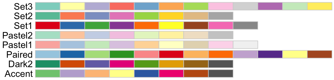
RColorBrewer qualitative (categorical, discrete) color palettes.
sequential- These are used to represent data that follows a progression or gradient, such as temperature, age, or income. Sequential palettes are designed to show ordered data, where lighter colors represent lower values and darker colors represent higher values (or vice versa).

RColorBrewer sequential (continuous) color palettes.
divergent- These are used to represent data that diverges around a central point, such as temperature anomalies, profit/loss, or survey responses with a neutral option. Divergent palettes are designed to show differences from a midpoint, with two contrasting colors representing values above and below the midpoint.
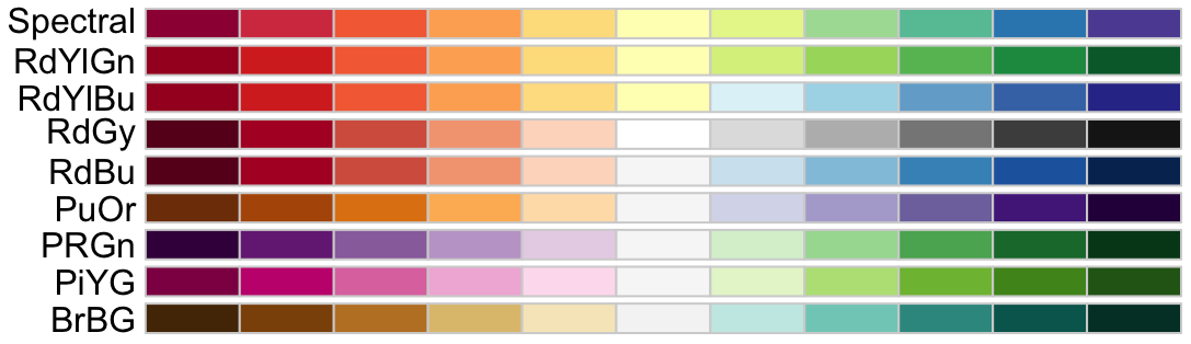
RColorBrewer divergent (continuous) color palettes.
6.2.3 Hiding a legend
One final modification that we’d like to make is to hide the fill legend so that the graph itself has more room. You can do that with the guides() function.
guides(fill = "none"): Removes thefilllegendguides(fill = "none", color = "none"): Removes both thefillandcolorlegends.
You can guess how you might remove other legends.
For more information on guides(), see the documentation.
6.2.4 Experimenting with colors
The following code block provides a great place for you to play with themes. Go through the following steps:
- Take a look at the specification of the theme and
theme()refinements at the end of this code block. - Run the code.
- Note how the graph looks.
- Delete the
theme()refinements and run the code again. - Note how the graph has changed.
- Delete the
theme_minimal()layer and run the code again. - Again, note how the graph has changed.
- Try out some themes that interest you from the lists in Section 6.1.1.
- After you have chosen a theme, try out a few of the theme refinements shown in Section 6.1.2.
Try out different sequential and divergent color palettes and convince yourself that a sequential one is better. Also experiment with scale_fill_grey(), scale_fill_gradient(), and scale_fill_viridis_c() (as well as different options for the second and third listed here). )
7: Test your knowledge
Now that you have completed the first part of the refine step, we are going to set the colors. Choose an appropriate color theme for the bars.
Solution
Run the following code.
You can see that we chose the "PuOr" palette but set it in a reverse order (direction = -1). This made orange the bad outcome in the survey which is what we wanted. You might have chosen a different color palette — that’s okay just so long as you were thoughtful about this.
It’s best if you show your choices to other people and get their feedback since, for the most part, they will be reading your graphs without you around.
7 Summary
This was a very long lesson, that’s for sure.
However, you now know much of what it is that ggplot2 can do. And, more importantly, you know how to read and revise these plots for your own uses.
As we stated at the very beginning, most of the time you will only go through the application of the geom_*()s and will skip the rest of the steps. For graphs that will stick around, you will apply more effort to the frame, themes, and colors. But you can choose to do it, or not.
The power of R/tidyverse/ggplot2 is now available to you. Use it wisely!